The Tattoo That Spells If Not Now Then When
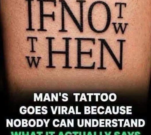
A photograph of an unusual tattoo left thousands of social media users confused as they tried to decipher the mysterious message written across someone’s skin.
At first glance, the tattoo appeared to contain an ordinary motivational quote. However, its complicated lettering made the words almost impossible to recognize, turning a simple photograph into an unexpected visual puzzle.
Curious viewers began zooming into the image, adjusting their screens, and examining individual letters. Despite their efforts, overlapping characters and unusual spacing made the message difficult to understand.
Even people familiar with tattoo designs and graphic lettering reportedly struggled to interpret what the artist had created. The arrangement of the words made the design look more like a collection of confusing symbols than a readable sentence.
The tattoo’s owner reportedly intended to create a permanent reminder about determination, perseverance, and the importance of taking action rather than waiting for the perfect moment.
Eventually, online discussions helped reveal the hidden message: “If not now, then when?” The short motivational phrase immediately made sense once viewers understood how the lettering was arranged.
However, discovering the answer did not make the tattoo completely easy to read. Some people continued struggling to distinguish individual words, even after knowing exactly what the message was supposed to say.
The unusual design created an interesting contradiction. A quote encouraging people to act decisively had become a puzzle that required considerable patience to understand.
Ultimately, the photograph demonstrated how important presentation can be. Even the most meaningful words can lose their impact when their design makes them difficult to read.
The photo makes the first line look as if it should be read across in a single pass. There is a large sequence of letters, with smaller characters fitted into spaces beside it. Reading only the largest letters leaves pieces of words missing. Reading every letter in horizontal order creates a different problem because some of the smaller letters belong with the word above or below.
Once the phrase is known, the photograph can be read from the other direction. The large letters give the eye a starting point, and the smaller letters fill in the endings. The upper and lower lines can then be read as two parts of the question. It is easier to see why people struggled when they began with no idea what sentence they were looking for. A conventional space between words would have done much of that work for them.
The placement is part of the visual effect. Large letters dominate the composition while the smaller ones sit close to their edges. At the size the photo appears in a social media feed, those smaller marks can look like ornament. Enlarging the photo helps reveal the shapes, but the reader still has to decide which letters belong together. That is the task that made the picture work as a puzzle.
The intended phrase asks a person to consider why they are waiting. The online discussion became about the wait required to read that phrase. Some people treated the design as an invitation to look more closely. Others saw the legibility problem first. Both reactions start with the same arrangement of letters, and both make more sense once the sentence can be read in full.