Why One McDonald’s Has Turquoise Arches
When McDonald’s tried to plant its unmistakable golden arches in Sedona, it ran into something stronger than brand recognition: a community determined to protect its identity. This wasn’t just about a sign. It was about whether a global symbol could overpower a place defined by its natural beauty. In Sedona, the answer was clear—no.
Here, the landscape isn’t background scenery; it’s the centerpiece of everyday life. The red rocks, the soft desert tones, the way light moves across the cliffs at sunset—all of it forms a visual harmony the town guards carefully. By the time McDonald’s arrived in 1993, Sedona already had strict design regulations in place. Buildings, colors, and signage were all expected to blend into the environment rather than dominate it.
The classic bright yellow “M” posed a problem. Against Sedona’s muted palette of reds, browns, and earth tones, it would have stood out sharply—too sharp, officials believed. It wasn’t just a question of aesthetics; it was about preserving the feeling of the place, the sense that nothing artificial should shout louder than the land itself.
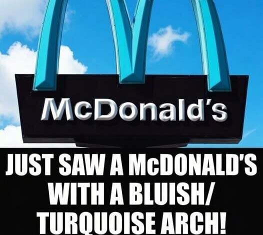
What makes this story different is what happened next. Neither side backed away. Instead of abandoning the project or forcing it through unchanged, they chose compromise. The arches stayed—but their color changed. The iconic yellow became turquoise, a shade tied to the Southwest and far gentler against the surrounding rock formations.
That single decision turned a potential clash into something quietly iconic. Today, the Sedona McDonald’s isn’t just another fast-food stop—it’s a small landmark. Visitors photograph the turquoise arches almost as often as the red cliffs behind them. It’s a subtle reminder that even the most powerful global brands can adapt when a place draws a firm line.
Sedona didn’t reject change—it shaped it. And in doing so, it proved something rare: preserving identity doesn’t always require saying “no.” Sometimes, it just means insisting on a better “yes.”